Did You Know?
Food access survey results show discomfort, lack of access
In preparation for an upcoming virtual town hall on the topic of food access and public transit on December 15, we conducted a survey.
The goal was to gain insight into topics like whether public transit has helped or hurt peoples’ food security and whether people have to take transit to other neighborhoods to get fresh food.
Here are some of the results of the survey:
- On a scale of “very comfortable” to “very uncomfortable,” most respondents currently feel “uncomfortable” riding public transit.
- The three top worries of respondents about taking public transit are health concerns, safety concerns, and waiting times.
- COVID-19’s impact on neighborhood grocers has made it necessary for some survey respondents to leave their area to access food. Most respondents, however, said they don’t have to leave their neighborhood to access food.
- Several respondents noted a decrease in bus frequency during the pandemic.
In order to help foster relationships and build dialogue with service providers in the communities we focus on, we also asked questions specific to food pantries. Almost all of the respondents who use food pantries said that they feel vulnerable using public transit to reach the pantries.
The general consensus of feedback from pantry users is that people feel that pantries are too far from public transit stops, there isn’t enough enforcement on COVID guidelines, and because of this, there isn’t enough room for people to bring their food aboard the bus or train given the crowding that occurs.
UPDATED: If you would like to learn more about the intersectionality of food access and public transit, please check out our virtual town hall discussion from December 15, featuring State Senator Mattie Hunter, State Representative Delia Ramirez, Jan Deckenbach, director of the Hyde Park Kenwood Food Pantry, Ruth Rosas of CLOCC, and Cosmos Ray of Bronzeville Kenwood Mutual Aid.
Alex Perez, Advocacy Manager, also shared research he contributed in the form of the maps below. His audio had some issues during the town hall so we have copied his talking points below each map as well.
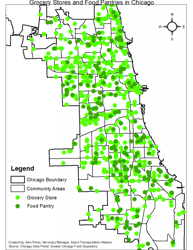
The first map is the location of the grocery stores and food pantries in Chicago. The lighter green dots are grocery stores and the darker green dots are food pantries. The data came from the Chicago Data Portal and the Greater Chicago Food Depository. In this map, you can see the number of food pantries and grocery stores per community area. From the map, you can see some communities don’t have any food pantries or only have 1 or 2 food pantries and grocery stores.
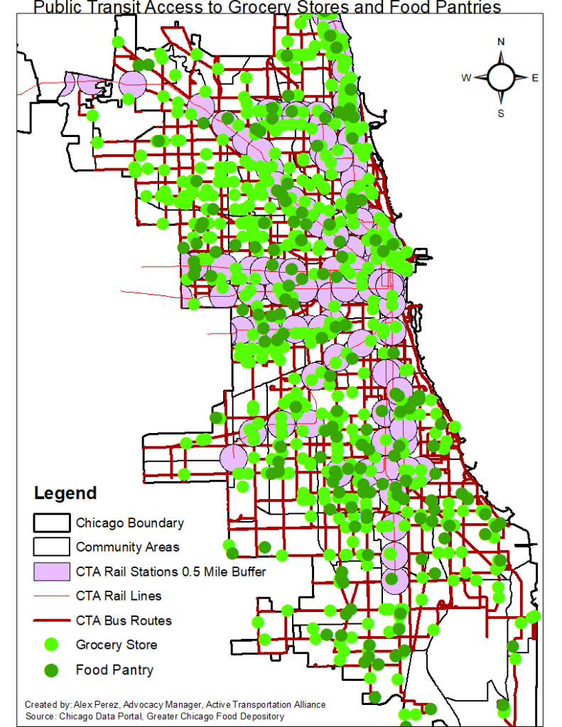
As Rylen mentioned, 92% of respondents said that they felt vulnerable using public transit to access food pantries and that pantries are too far from public transit stops so I mapped that relationship between food access and public transit. The map on the right is looking at public transit access to grocery stores and food pantries. The darker red lines are the CTA bus routes and the lighter red lines are the CTA rail lines. The purple circles are a half mile buffer around CTA rail stations to show how many food pantries and grocery stores are in proximity to public transit. The further south one travels on CTA, there are less food pantries that are accessible using CTA, especially on CTA rail. When looking at the north side of the city, there are more food pantries accessible using CTA. Looking at the far south side beyond the 95th Red line station, people must rely on the bus if they are using public transit to access food or if they don’t have access to a car. One key thing we don’t know, is how far people are traveling to access food in the city.
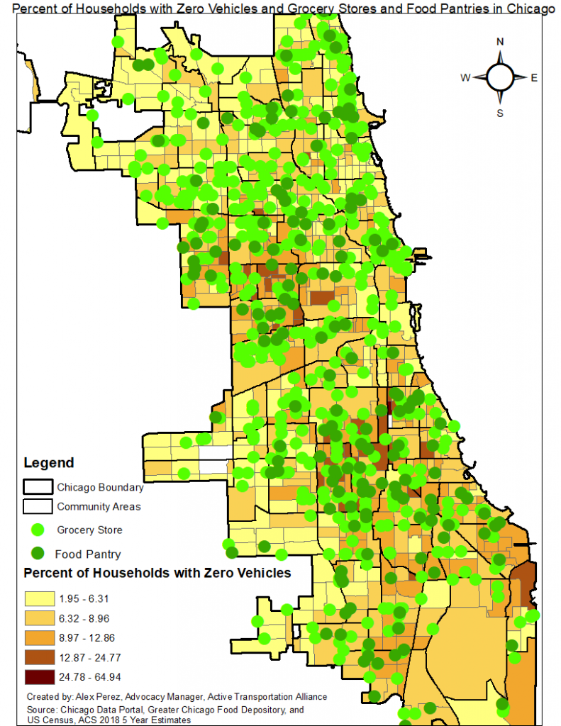
The map above is looking at the percent of households with zero vehicles and the location of the grocery stores and food pantries in Chicago. The data came from the US Census data American Community Survey 2018 5-year estimates. The darker the color within the census tract, the higher percentage of people living there dont have access to a car. People who don’t have access to a car are more likely to rely on public transit or walking to access food. Looking at the map, there is a concentration of people without a car in the west side, south side, and south east side and these areas are majority people of color. There are grocery stores and food pantries located nearby the west side and south side areas of households with zero cars, but that is no the case in the far south east side.
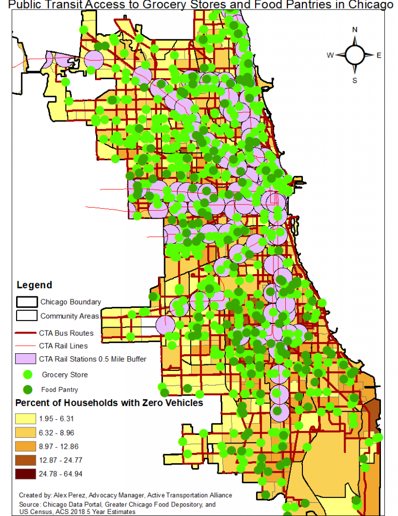
The map above is looking at all the layers together from the previous 3 maps. I wanted to separate the data layers for everyone to better understand the last map as it looks like it has a lot of data. It highlights the location of grocery stores and food pantries and their accessible using public transit. As well as the percentage of where people who don’t have access to a car live across the city.
Make a Donation
Your tax-deductible donation supports the important work that Active Trans does throughout the region
